Optimizing UI & UX for eCommerce

PROBLEM #1:
Simplifying website navigation.
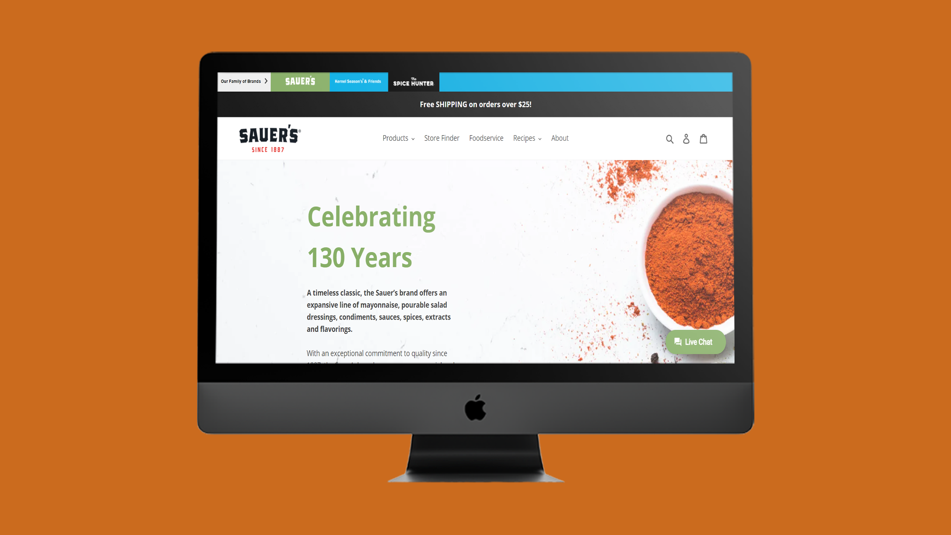
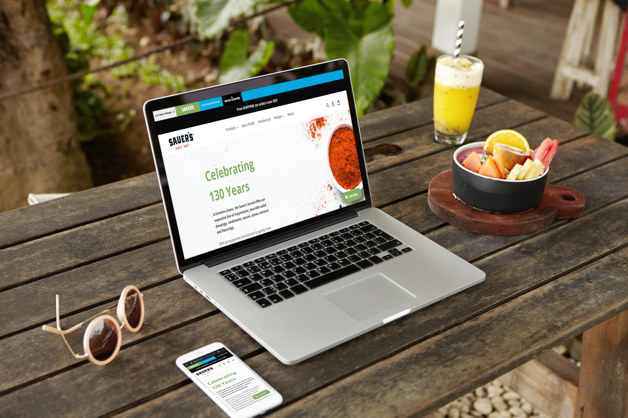
The Sauer’s Brands website has several spice brands under it’s umbrella, each with their own separate webpages. Users arrive at the homepage and can scroll the webpage content or follow links into the six different sub-brand webpages. Analytics data indicates that a high percentage of users exit the homepage after seconds of browsing.
SOLUTION:
I created a persona and user journey map to gather a better idea of the needs of the website users and to define design goals. A consistent omnipresent website navigation bar was the focus of the new design to ease the tension users experienced when they navigated to the homepage and the sub-brand webpages. Multiple rounds of wireframe sketches were created then narrowed down into two digital wireframes via Adobe XD based on client feedback. The client then selected one wireframe to move forward with as the final design.
USER JOURNEY MAP:

PERSONA:
Incorporating internal data & research from the client, the user persona below was developed to better define project goals and the needs of the targeted audience.

PROBLEM #2:
Making ecommerce frictionless.
The existing website has ecommerce built in so users can purchase Sauer’s spices however, the shopping cart doesn’t accurately display the quantity of products. This creates an unusual online shopping experience when navigating the sub brand web pages since users can’t see what they've previously added to their carts. Easing this frustration is key. By delivering a more familiar shopping experience & accurately depicting what’s currently in a user’s cart we can aim to boost the ecommerce experience & encourage repeat users.
SOLUTION:
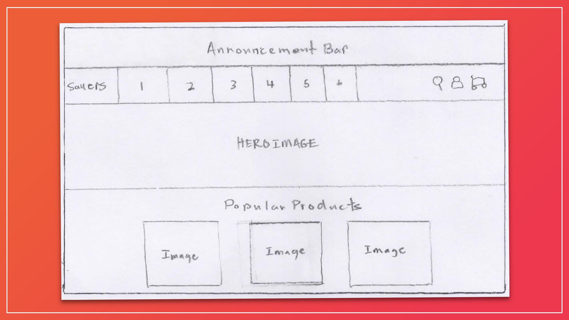
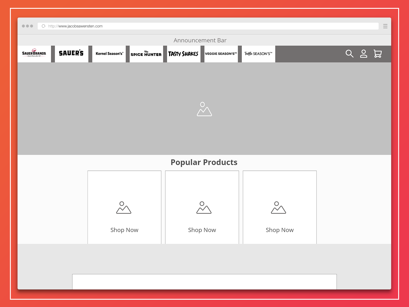
Priority was given to the updating the functionality of the website's shopping cart on the backend as well as the design of the omnipresent shopping cart. This allowed for users to not only have a familiar shopping experience as they navigate the entire website but also encourage repeat visits and purchases. Sketches of the new wireframes were created by hand and translated into Adobe XD.
WIREFRAMES:
RESULTS:
The team saw a 15% increase in ecommerce conversions as a result of the initial changes. We expect a greater increase in conversions as the new website design is finalized and implemented by the developer.
TOOLS:

UX Strategy:
Pen & Paper, Wireframing

Creative Suite:
Photoshop, Adobe XD; Figma